Bynx Coffee
The Problem
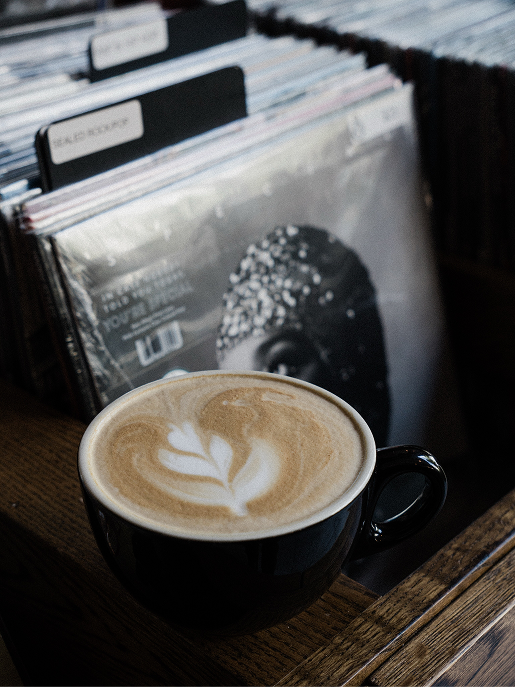
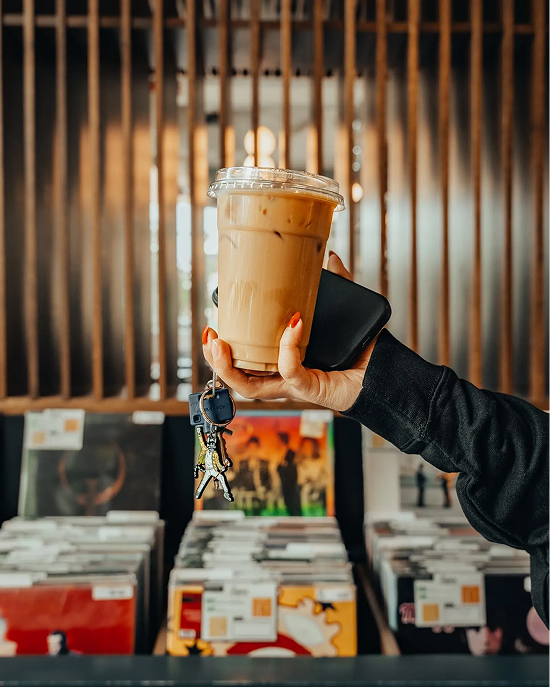
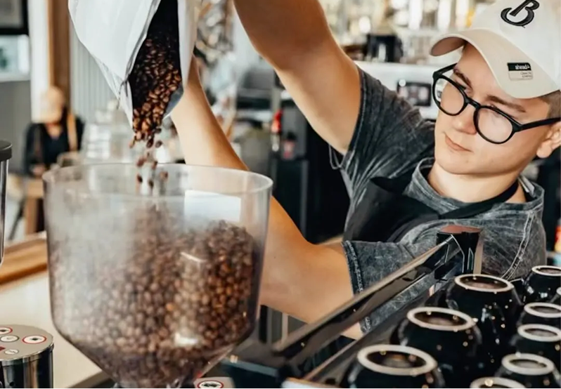
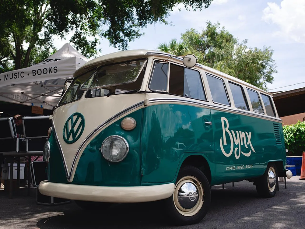
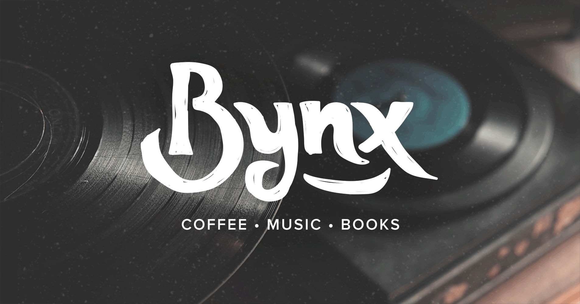
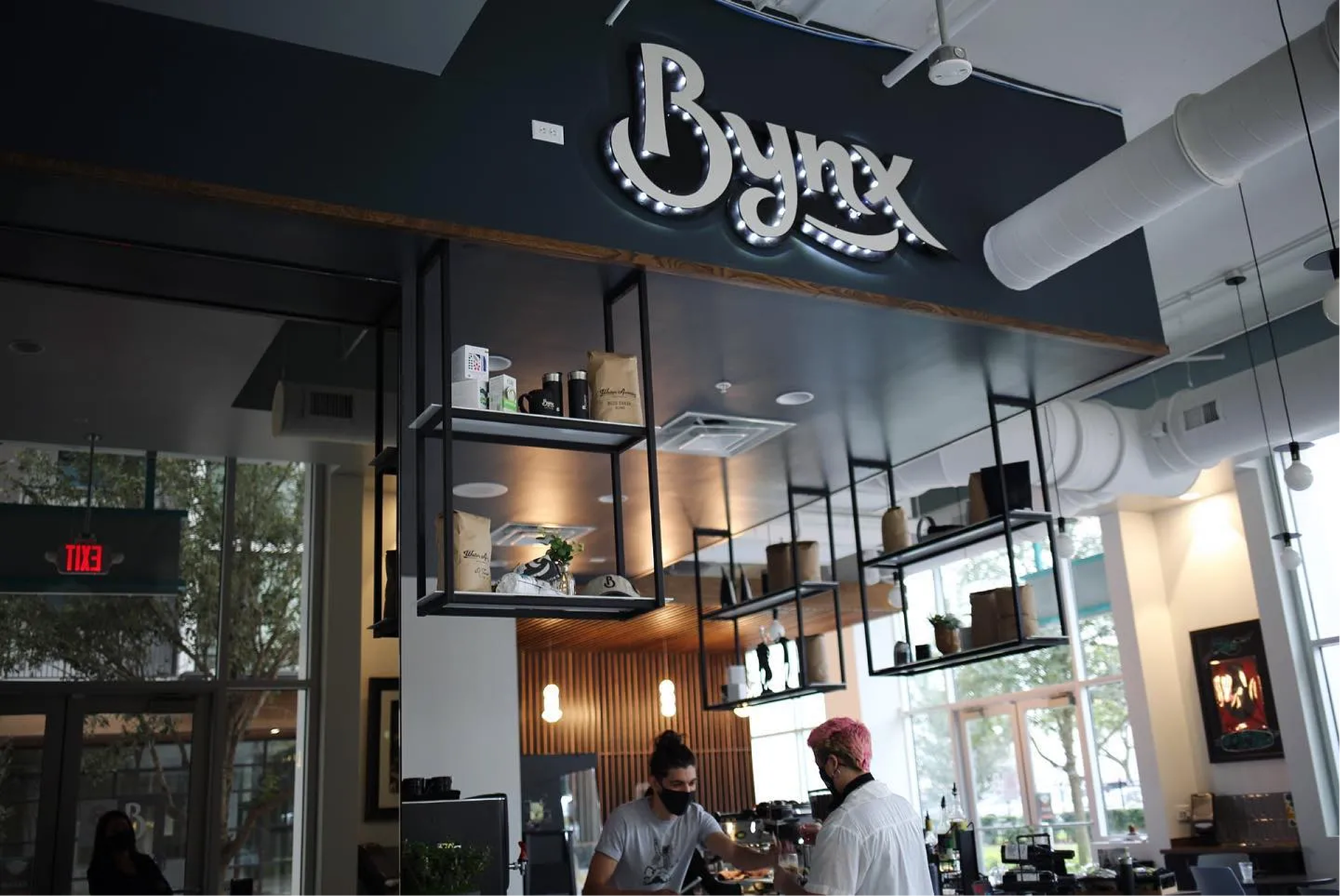
Bynx was launching their first brick-and-mortar location after years of selling coffee out of a hippie van, and they needed branding that captured a very specific feeling: psychedelic-era nostalgia without feeling like a costume of the era. The logo had to feel rooted in 60s and 70s music culture and signal that this was a creative third place for music lovers, readers, and coffee drinkers alike.
My Process
Discovery
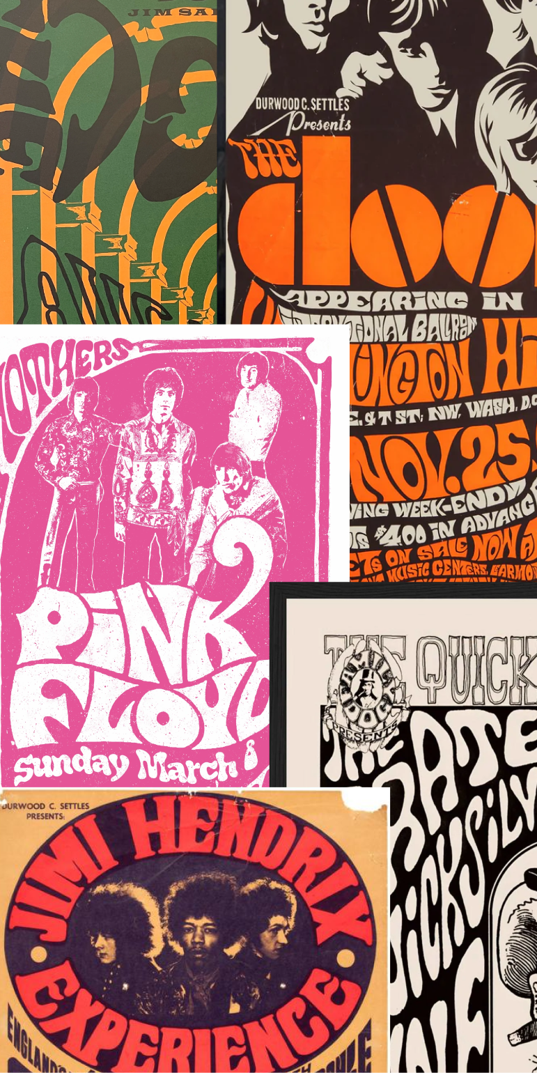
Studied the client's musical touchstones (The Doors, Hendrix, Pink Floyd, Grateful Dead) and built a mood board from psychedelic-era album art and concert posters to ground the visual direction in the eras they cared about.
Strategy
Our team assigned three designers to develop competing concepts in parallel. This let us critique a wider range of directions internally before presenting two refined options to the client for final selection.
Design
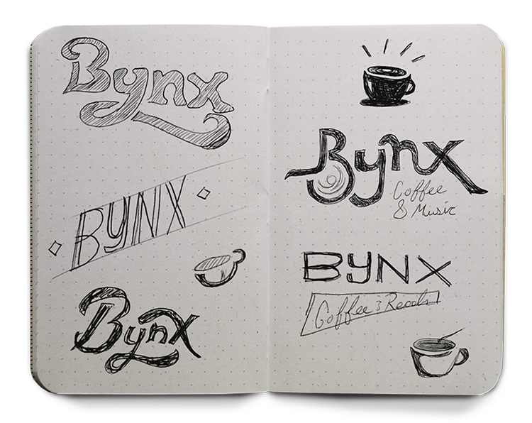
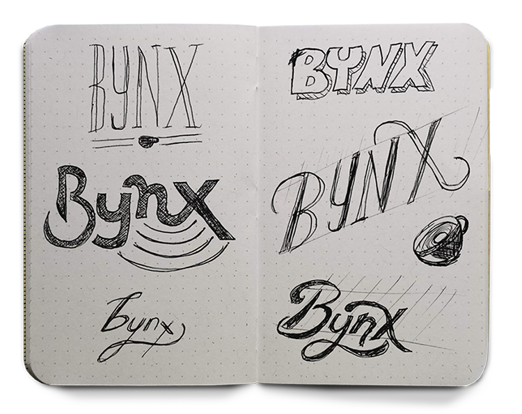
Sketched numerous typographic treatments of the made-up word "Bynx," focusing on bold, smooth letterforms that could flow together as a single mark. Refined the strongest concept to work on both busy and stark backgrounds.
Development
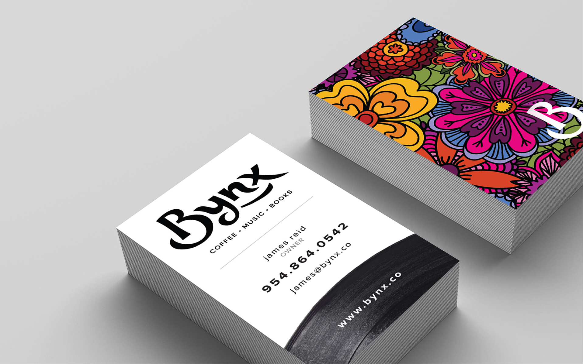
Built out the full brand system: vector and bitmap logo files, a brand guide with usage dos and don'ts, business card variations, email signatures, and letterhead. Delivered everything ready for print and digital application.
Results
- The client chose my concept out of a competitive internal process. Three designers developed concepts in parallel, and after internal critique, two were presented to the client. They selected mine without requesting revisions to the logo, only asking for adjustments to image pairings on business cards. That kind of clean approval is rare in branding and reflected how closely the concept matched what they wanted.
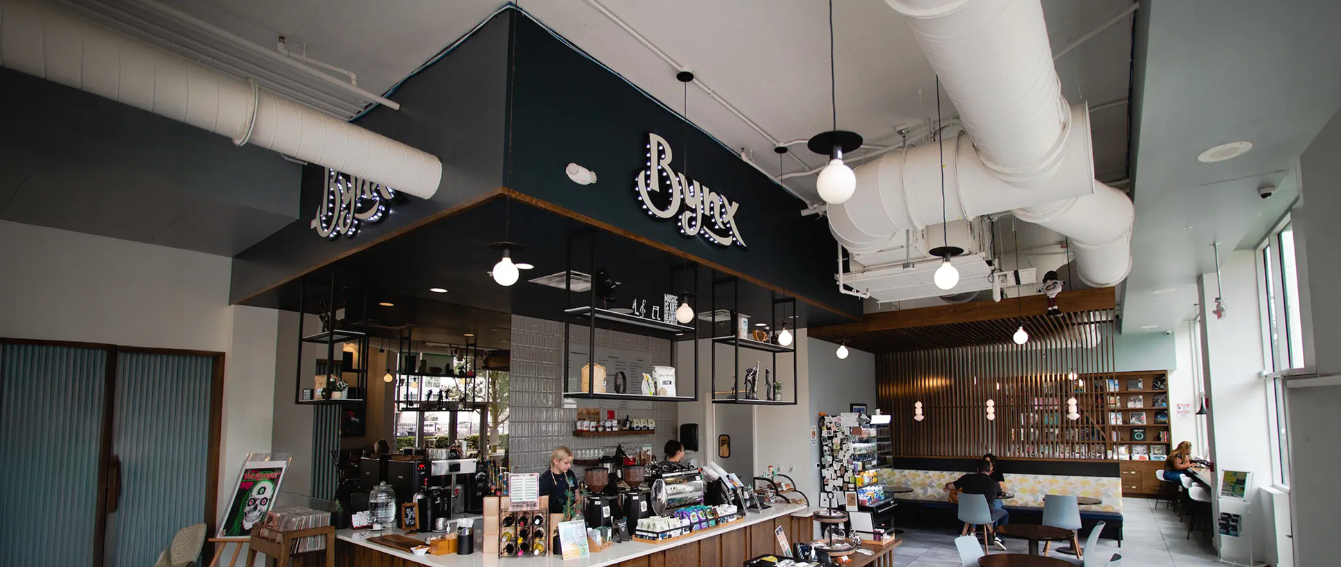
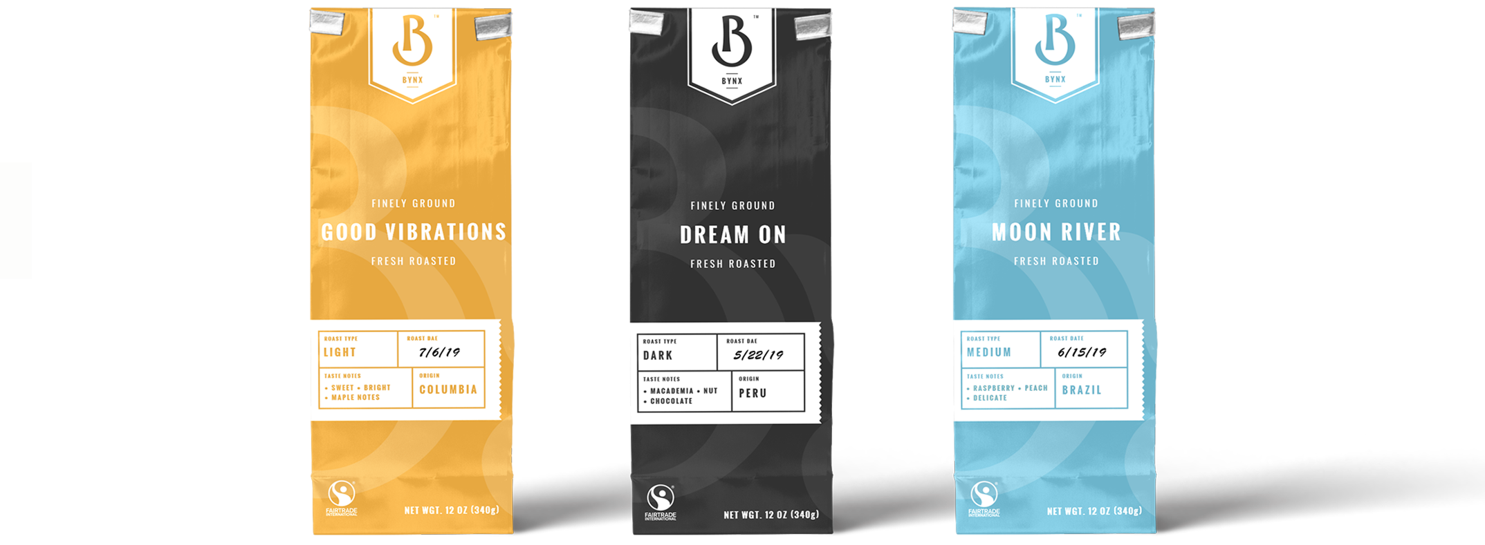
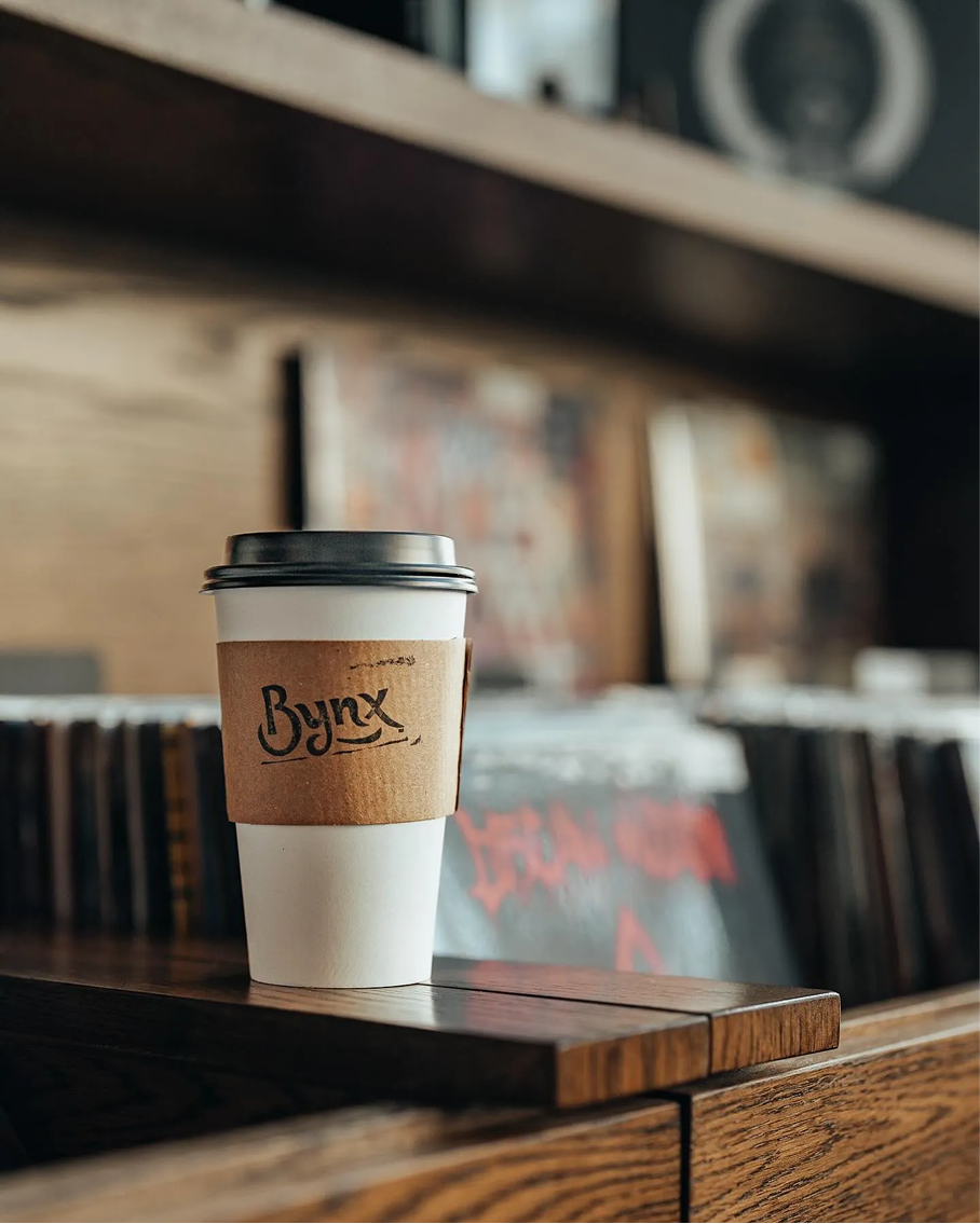
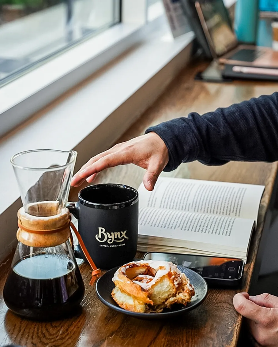
- The logo proved its versatility in the wild. A core design goal was a mark that could hold up across wildly different contexts, from a marquee sign above the storefront to a coffee sleeve in someone's hand. After launch, Bynx put the logo on signage, t-shirts, mugs, event posters, and merchandise. The bold typographic approach worked on both busy psychedelic backgrounds and stark black-and-white.


Executive Feedback
Rated 5 out of 5 stars
“Garrett has been an incredible asset to the team. His positive attitude and willingness to help with a smile was a great fit for our culture and his design talent is first rate. I would recommend Garrett for a position within an agency that needs someone flexible, helpful, and talented in building brands and websites. If you would like to discuss my experience with Garrett please feel free to reach out, I would be happy to help answer any questions you may have.”